

A change of digit involves major news, we will focus on detailing the most important ones in this blog post. Sit back comfortably as the Simplicité line stops at the “Bonne Nouvelle” station.
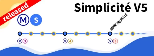
The first novelty of this V5 concerns versioning. No more patchlevels, now the versions are more commonly called 5.X.Y. This way of naming should allow us to improve the readability of the new versions we deliver:
• The number (here 5) is the number of the major version
• The x corresponds to the minor version number (it is equivalent to the patchlevel levels of the old versions)
• The y corresponds to the revision number, it did not exist in previous versions (the Git commit ID was used to track the revisions, which was not very intuitive), it will be increased each time a revision is made.
Note, we will take advantage of this change in versioning to be more dynamic on the release of versions so V 5.0 is official, V 5.1 will therefore be released only 1 to 2 months later, version V 5.2 will follow the same timeframe. There will be betas and releases more regularly, making it possible to limit the risks associated with upgrades.
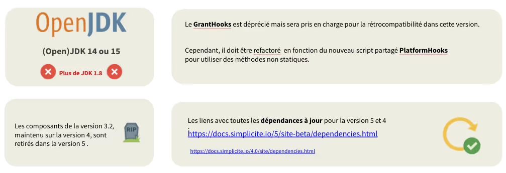
Very important change in terms of technical platform: with version 5 there is no longer support for JDK 1.8, to run Simplicité you now need to be at least on version 11. But as always, it's best to use an up-to-date JDK, 15 at the time of writing.
Also note the end of the legacy components (version 3.2 of Simplicité) and the deprecation of “GrantHooks” in favor of a new shared script “PlatformHooks”.
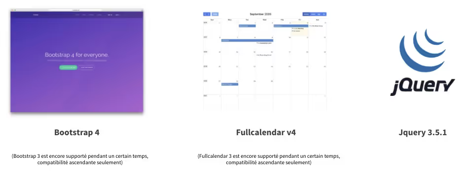
True to our leitmotif of updating the components we use for the UI (User Interface). Bootstrap 4, Fullcalendar 4, and Jquery 3.5.1 are becoming the norm.
While it is still possible to use the old versions of these third-party components (except for jQuery) we strongly recommend that you migrate your developments to these new versions. Older versions of these components will no longer be supported in the next major release.
This should be considered as an aid to the transition, but it does not exempt you from making this transition 🙂.

The devil is in the details, you have to look at the CSS side to find the first “big” change with the transition to bootstrap 4, exit the “px” welcome the “rem” (1rem=16px). This unit of measurement offers a much better responsiveness of the display depending on the size of the screen. This allowed us to include a very practical accessibility feature, a slider in the user's hand allowing the user to zoom in at will.
Slide to Zoom
As part of the new features brought by Bootstrap 4, the use of “flex” instead of the traditional “float” allowed us to develop a compact or airy mode. Very practical for screens containing large forms since the field labels pass to the left and the margins are reduced to save as much space as possible.
Compact or airy mode
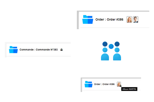
A new mode called “locking” allows you to block the opening of an updated form. In other words, the first person who opens a form automatically locks the form. Other users who open this same form will be read-only and will see the person who has the lock thanks to a small padlock at the avatar level at the top of the form.
As a reminder, the other “timestamp” are:
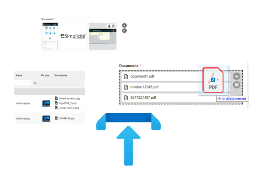
It was a recurring need for Simplicité users, to allow the upload of several documents on a single field (document type). Today nothing could be simpler, by setting up a “multi-doc” rendering type on the document field, the user can upload N documents by choosing via the browser selector or directly by drag'n'drop.
The cherry on the upload is that it is also possible to choose the preview that will be done: as a list or as a thumbnail.
Note that it is also possible to limit file types (MIME-types or extensions: pdf, image...) as well as to specify minimum or maximum sizes.
It was possible to create predefined searches and save them for the end user to start. In V5 “Good News” we made a separation between reading and writing. We can thus create searches that are public, editable or not.
By default, write and read permissions are enabled, but it is now possible to make these searches only available read-only.
New trends to help designers develop more quickly (and easily).
It is a “superuser” who allows you to reconnect, without a password, to any existing account. This mode is very useful for development, it allows you to change profiles without necessarily having all the passwords of all users. It is possible to change the user by entering only the user's login.
In production, this can be used for support functions to take control remotely and reproduce a problem.
Obviously to be reserved for named users, this flag will not be put at the global level on the platform.
New function to put yourself in the shoes of a user
This new mode offers the possibility to connect with all the accounts with which I connected on the workstation (in local storage). This is a normal use that we can do in production if we have several hats instead of logging out and re-entering the password.
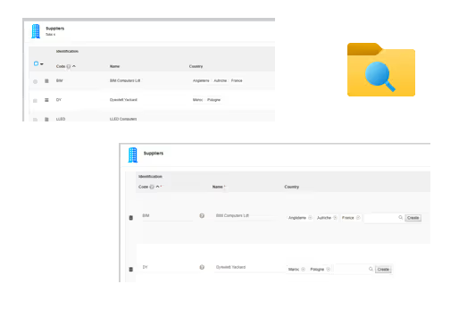
The representation from one object to another evolves, the relationship is no longer necessarily a list, but here thumbnails in the form of pillboxes that can be added or removed. The action performed will update the database.
So it is now possible to edit and search for this N-N relationship directly from the list. Here will be a “fulltext” search on the functional key. For example, my functional key is a list of countries, all I have to do is type %Fra% to find the france.
Another evolution on lists is the possibility of grouping the elements of a list with a counter. The use here will typically be to group product families (in our demonstration these are tablets, computers, smartphones...).
Grouping the items by categories
Sometimes forms are arranged in the form of tabs. In fact, when an error appeared on another tab of the form, it was difficult to find your way around.
From now on, a simple click on the error reported (at the top of the page) allows access to it thanks to the focus that will be made. Simple as Simplicité.
Simplified error management
Classic spinners give way to smoother loadings such as skeleton (on lists, forms and treeviews).
“Skeleton” loading interfaces
Also as news on input ranges:


New richer rendering of the notepad, everything is stored in a blob in the database (in JSON format), but without special authorization.
It is thus possible to have:
The use case is typically for operational follow-up of files, task progress or case management.
New Notepad rendering
As for the other new features:
Autosize of fields, grid and speech synthesis
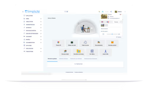
Historically, the shortcuts were located in the menu at the top right of the application header. This mode remains available, but it is now possible to also display these shortcuts on the home page (as a view) of the application.
These shortcuts also support tooltips.
In V5, when uploading or downloading several files, everything can be buffered and by definition asynchronous. It is not the browser that does the download but Simplicité that manages in the back office.
When users process large files, there are no more blocking elements. Export instances are isolated in specific spaces to avoid any conflict with what is happening on the screen.
The new V5 of Simplicité integrates APIs (class helper) that allow you to interact with Trello and Slack. For example, these APIs are used in our demo for alerts (on state transitions). Alerts formerly sent via email, for example, can be sent via Trello or Slack. These are uses to be adapted according to the problems of each application of course.
Docusign is now a native object with all libraries up to date. The document signing process is carried natively. This makes it possible to put an envelope that contains N-documents with initials and signature spaces as well as lists of recipients who can be known users of the platform or external users. Then everything is sent to Docusign, the webhooks implemented allow Simplicité to know who signed, everything is stored in the application.
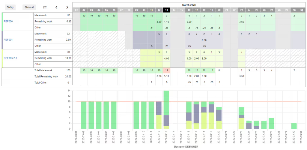
This component existed in previous versions of the platform, it is back in V5. So between two resources, for example, a person and a project, it is possible to assign tasks with data within this N-N relationship. This typically makes it possible to allocate time according to the tasks described.
The timesheet can be defined per day/per week/per month. It is also possible to click on a task to change the angle of view by contrast.
This component makes it possible to warn users:

As soon as a crosstab has editable rows, it is possible to modify its cells by simply clicking on them. The case here will be typically for translations. It is thus possible natively to click in a cell to be translated to directly edit the text and the value.
The save button allows you to send all translations “en masse”.
The use of this feature for the translation matrix is an example that can of course be applied to other cases.

Still on the principle of the hybrid application (Cordova), this new V5 compatible application makes it possible to greatly facilitate the management of Upgrades (all static resources are downloaded locally).
It will be updated by itself without going through the awning. Any Simplicité V5 application can connect with applications deployed in the Apple Store and the Play Store.

In order to limit the incompatibility problems of our Simplicité components. It is now possible to load third-party component Classloaders in a single Classloader (Classloader stack)... No collision possible (for example with the Docusign component).
Monitoring has got a new tab “ClassLoaders” allowing you to debug all Classloaders independently of each other.
In addition, it should be noted that the Monitoring component is no longer an Iframe, it is now natively integrated into Simplicité.
For designers who don't code in Eclipse, VSCode, or any other IDE, the code editor has improved.
The code editor has easy navigation to access the resources of the various modules more quickly. Tree navigation allows easy access to the various objects.
At the first connection, the user now chooses this language of preference among the languages known by the platform.
This information is then stored in a field (“preferred language”) for the user. He will then have the possibility to change this language on the fly and easily if necessary.
It is a resource that can be modified if necessary to adjust or hide some of the information.
It is a resource that can be modified if necessary to adjust or hide some of the information.
There is now a real dichotomy between module dependencies and hierarchy. It is now much clearer for designer-administrators to find their way around.
And finally clearer information in the session clear cache:
These are the biggest new features of V5.0 — Good news, but as this list is not exhaustive, we recommend that you read the full release note Right here

